

6. Why Do Some Tattoos Have a Wow Factor While Others Feel Cheap?
One of the biggest misconceptions in tattooing is the belief that the quality of a tattoo is directly related to the importance of the idea behind it. People often assume that a tattoo with more meaning, more symbolism, and more personal references will automatically become a better tattoo. In reality, meaning and visual quality are two completely different things.
Tattoo by Anja Ferencic, Photo by Karlo Čargonja
A tattoo can carry a deeply personal story and still look visually weak. At the same time, a tattoo with no particular meaning can have incredible presence and leave a lasting impression. The reason is simple. A tattoo is, first and foremost, a visual art form. We experience it with our eyes long before we understand what it represents.
This is why tattoos are subject to the same principles as painting, sculpture, photography, architecture, or graphic design. Every visual work is built from the same ingredients: line, shape, form, space, texture, light, shadow, and value. However, ingredients alone never guarantee a great result. What matters is how they are arranged. Composition, contrast, balance, proportion, rhythm, hierarchy, and unity are what create impact. These are the things people often cannot explain when they say a tattoo looks good, but they are usually the reason why it does.
One of the most common mistakes I see is trying to fit too much information into too little space. Many people approach a tattoo as if it were a list of everything important in their lives. A clock representing time, a rose representing love, a lion representing strength, a date, a quote, a religious symbol, a family reference, something connected to travel, and a few additional details that seem meaningful at the time. Individually, none of these things are problematic. The problem begins when every single idea is forced into the same design.
At that point the tattoo often stops functioning as a composition and starts functioning as a collection of symbols. The more elements compete for attention, the less attention each of them receives. Strong design is rarely about how much can be added. More often it is about understanding what can be removed. In my experience, many tattoos would benefit far more from subtraction than addition. There comes a point where adding another detail no longer improves the design but weakens it.
Tattoo by Anja Ferencic, Photo by Karlo Čargonja
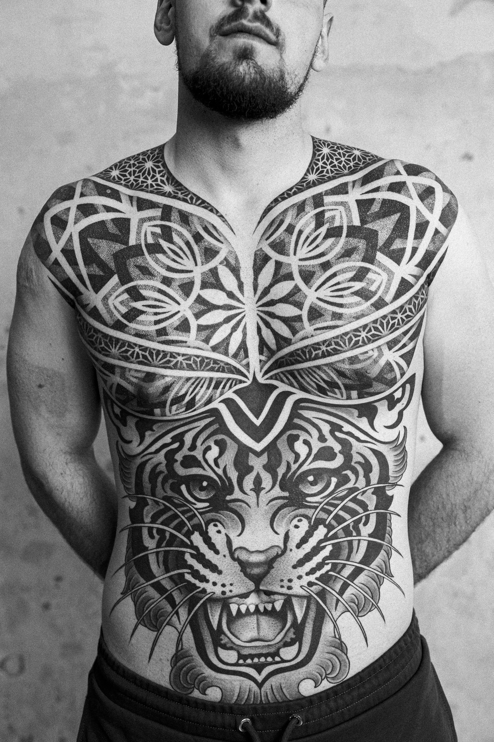
Another issue is the lack of hierarchy. Every successful visual composition needs a clear focal point. Something has to lead. Something has to dominate. There must be a reason for the eye to stop somewhere before moving through the rest of the design. When every element is equally important, nothing feels important. When everything tries to dominate, the result is usually visual noise.
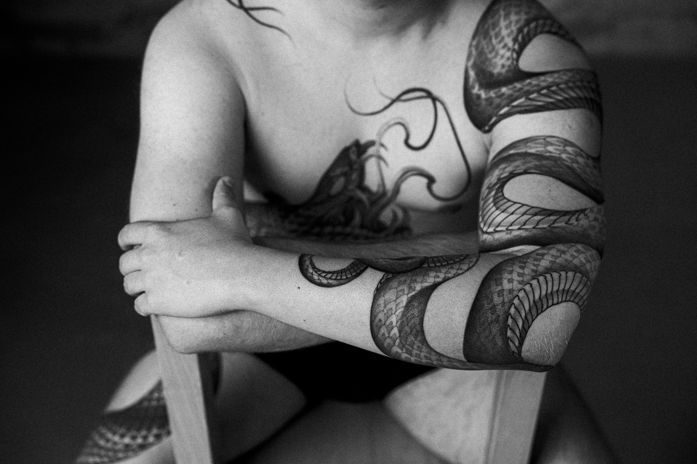
The same principle applies to contrast. Many people see empty skin as unused space, when in reality it is one of the most powerful design tools available. A solid black area placed next to untouched skin will always appear stronger than the same black surrounded by layers of grey tones, textures, and background elements. Contrast creates impact. Contrast creates readability. Contrast creates depth. The obsession with filling every available millimetre of skin often removes the very thing that makes a tattoo powerful in the first place. Sometimes what is left untouched is just as important as what is tattooed.
Scale is another factor that is frequently underestimated. The body is not simply a surface where a tattoo is placed. The body is part of the composition. Every arm, leg, shoulder, or back creates a framework that influences how the design will be perceived. A design can be beautifully drawn and still feel wrong if its size is not appropriate for the area it occupies. When scale is correct, the tattoo feels natural. When it isn’t, something feels off even if the viewer cannot immediately explain why.
I often hear people say they want their tattoo to be neither too dark nor too light. While that is understandable, it can become problematic if it comes at the expense of contrast. Every strong tattoo needs a full range of values. It needs its brightest lights and its darkest darks. In tattooing, untouched skin is often the lightest value available and solid black is the darkest. Without those extremes, a tattoo loses depth, structure, and clarity. Many tattoos that avoid strong contrasts end up looking faded before they are even healed.
Tattoo by Anja Ferencic, Photo by Karlo Čargonja
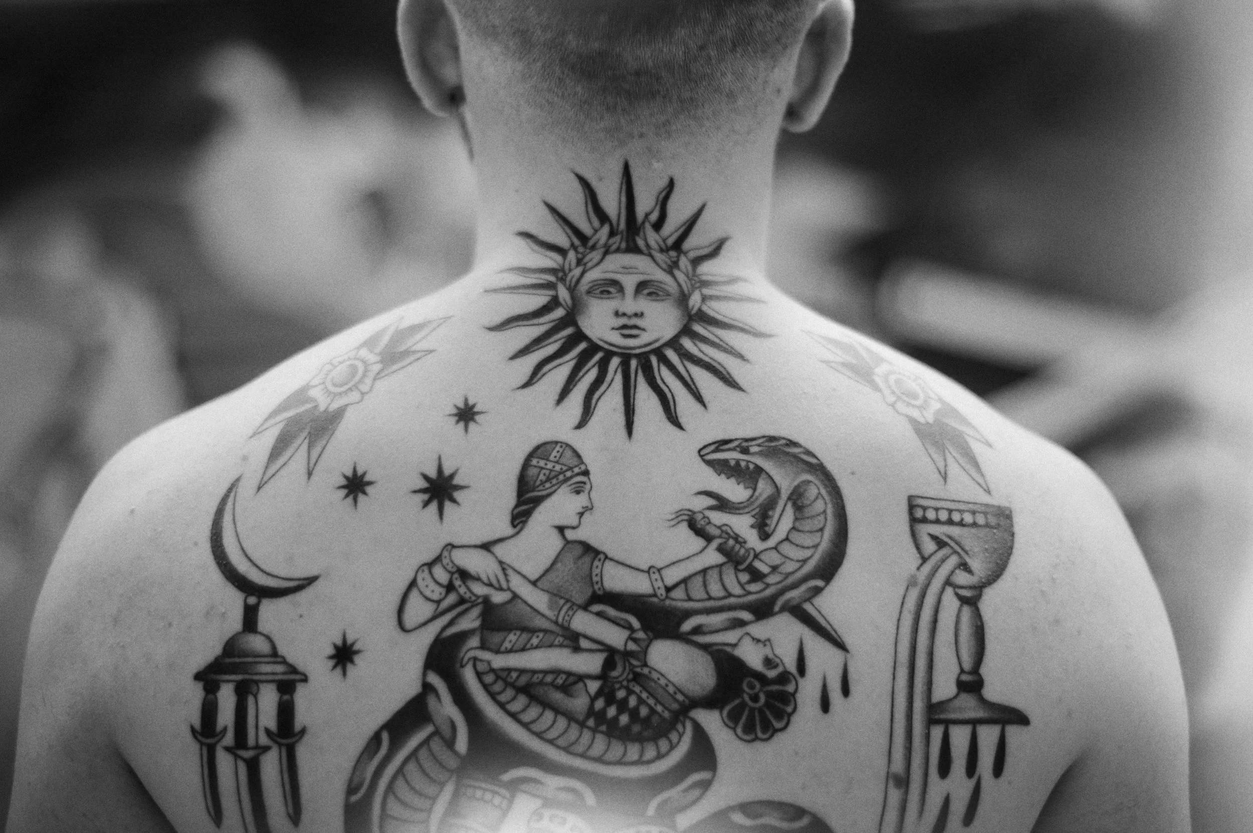
Mixing styles and unrelated themes presents another challenge. Combining different visual languages can sometimes create incredible results, but only when it is done intentionally. Simply placing unrelated elements next to each other does not automatically create harmony. A realistic portrait, a tree of life, geometric patterns, religious imagery, and decorative elements may all have personal meaning, but meaning alone does not create unity. Successful designs usually have a visual thread that ties everything together. Sometimes it is a repeating shape, a consistent texture, a geometric framework, or a shared rhythm running throughout the composition. Without that structure, individual elements remain isolated rather than becoming part of a larger whole.
One thing that is often forgotten is that tattoos do not exist on a flat canvas. They are not viewed from a single angle. They move with the body, wrap around forms, and are seen from countless perspectives throughout a lifetime. A tattoo that looks impressive in one photograph but fails to work on the body has missed an important part of its purpose. The goal of a tattoo is not simply to look good online. Its job is to enhance the body that carries it.
Perhaps the most important lesson I have learned over the years is that visual impact rarely comes from complexity. It comes from clarity. The tattoos that leave the strongest impression are usually not the ones with the most details, the most symbolism, or the greatest number of elements. They are the ones where every decision feels intentional. The ones where hierarchy is clear, contrast is respected, proportions make sense, and nothing exists without a reason.
Tattoo by Anja Ferencic, Photo: Ira & John
Knowing when to stop is often just as important as knowing what to add.
Written by Anja Ferencic